Mark Newman (see previous post Another world population map) has used his cartogram technique to make a series of sharp cartograms of the world (smoother than these rougher cartograms), some of which are shown below (land area, population, GDP, and GHG emissions):

Category Archives: Visualization


Mapping Sea Level Rise
 Jonathan Overpeck and others have a paper Paleoclimatic Evidence for Future Ice-Sheet Instability and Rapid Sea-Level Rise in Science (24 March 2006) that suggests that sea level rise due to anthropogenic climate change could occur much faster than people have previously expected. Possibly an increase of 5 to 10 m of several centuries. (For news articles see BBC, NYTimes, & Toronto G&M).
To visualize the consquences of sea level rise:
WorldChanging points to Flood Maps. A site that mashes up NASA elevation data with Google Maps, and offers a visualization of the effects of a single meter increase all the way to a 14 meter rise. Some examples are: Vancouver with 6m sea rise, New Orleans, and the Netherlands.
Also, Jonathan Overpeck‘s lab also has a visualization of the consquences of sea level rise for the US and the world.
Richard Kerr writes in a news article in Science, A Worrying Trend of Less Ice, Higher Seas:
The ice sheet problem today very much resembles the ozone problem of the early 1980s, before researchers recognized the Antarctic ozone hole, Oppenheimer and Alley have written. The stakes are high in both cases, and the uncertainties are large. Chemists had shown that chlorine gas would, in theory, destroy ozone, but no ozone destruction had yet been seen in the atmosphere. While the magnitude of the problem remained uncertain, only a few countries restricted the use of chlorofluorocarbons, mainly by banning their use in aerosol sprays.
But then the ozone hole showed up, and scientists soon realized a second, far more powerful loss mechanism was operating in the stratosphere; the solid surfaces of ice cloud particles were accelerating the destruction of ozone by chlorine. Far more drastic measures than banning aerosols would be required to handle the problem.
Now glaciologists have a second mechanism for the loss of ice: accelerated flow of the ice itself, not just its meltwater, to the sea. “In the end, ice dynamics is going to win out” over simple, slower melting, says Bindschadler. Is glacier acceleration the ozone hole of sea level rise? No one knows. No one knows whether the exceptionally strong warmings around the ice will continue apace, whether the ice accelerations of recent years will slow as the ice sheets adjust to the new warmth, or whether more glaciers will fall prey to the warmth. No one knows, yet.
Mapping anoxic zones – pt 2
Global International Waters Assessment is a systematic assessment of the environmental conditions and problems in large transboundary waters, comprising marine, coastal and freshwater areas, and surface waters as well as ground waters. Involving over 1,500 expert it has assessed 66 of the world’s major river basins and recently published a synthesis report. These publications are freely available online. The synthesis report‘s section on pollution provides a map of eutrophication impact.

As mentioned in a earlier post on mapping dead zones, eutrophication can produce large coastal hypoxic zones. The GIWA regional assessments reported that dead zones:
… have become increasingly common in the world’s lakes, estuaries and coastal zones, with serious impacts on local fisheries, biodiversity and ecosystem functions. Extensive dead zones have been observed for many years in the Baltic Sea, Black Sea and Gulf of Mexico. The GIWA assessment has compiled information on dead zones in the Southern Hemisphere, including several lagoons in the Brazil Current region, coastal locations in the Humboldt Current region, and in the Yangtze River estuary located in the East China Sea region.
Visualization of place in everyday life
 Seyed Alavi, a Californian artist, created a wonderful visualization in a public art/carpet for a bridge at Sacremento airport. He writes:
This project consists of an aerial view of the Sacramento River that is woven into a carpet for the floor of a pedestrian bridge connecting the terminal to the parking garage. This image represents approximately 50 miles of the Sacramento River starting just outside of Colusa, California and ending about 6 miles south of Chico.
In addition to recalling the experience of flight and flying, this piece, by depicting the larger geographical area, also helps to reinforce a sense of belonging and/or connection for the traveler. In this way, the carpet can also be read and experienced as a “welcome mat” for visitors arriving in Sacramento.
via WorldChanging: Aerial Mapping in Carpet.
See also commentary about the carpet and landscape visualization on Pruned.
Recovery Happens – Asian Tsunami impacts after one year
Jamais Cascio posts on WorldChanging
In the immediate aftermath of the December 26, 2004, tsunami, we pointed to satellite photos showing the before-and-after of coastal regions of Thailand, Sri Lanka, Indonesia, India and other affected locations. These images were among the most powerful representations of the disaster, as viewers could easily trace the path of destruction. New before-and-after images are now available, but these tell a very different story.
Photojournalist Zoriah covered both Sri Lanka and Thailand in the days following the tsunami; earlier this year, Zoriah returned to Thailand, and took pictures at the exact same sets of locations. WarShooter.com, a web portal for photojournalists covering conflict and disaster, posted the resulting side-by-side comparison this weekend. Some of the changes are subtle, but it’s clear that much of Thailand is well on the road to recovery.
John Stanmeyer also posted before-and-after shots, this time of Banda Aceh, Indonesia. Aceh still has much further to go than Thailand, but these images stand as record that human beings can, and will, choose to survive and flourish even in the wake of unthinkable disaster. (Warning: the first image of Stanmeyer’s collection includes a fully-visible corpse; the subsequent images aren’t nearly as disturbing.)
Visualizing Ecological Footprint of Nations
Following up on other global mapping posts (population cartogram (distorted) & pop vs. economy cartograms), here is a cartogram from Jerrad Pierce showing countries sized by their ecological footprint and coloured according the their status as a net surplus or debtor nation.
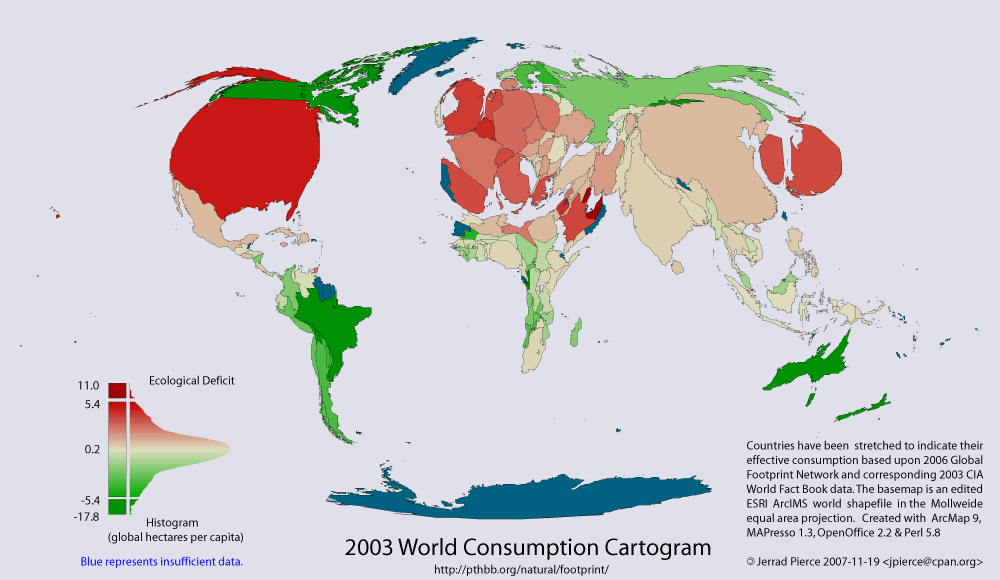
One the website, the map is explained:
This thematic map shows two variables; 1) coloration indicates reserve(green) – deficit(red) of national biocapacity and 2) area indicates absolute consumption of biocapacity.
Consumption = Appropriated National Biocapacity + Imports - Exports
The area of each country has been distorted to represent its consumption i.e.; its ecological footprint. Countries which appear larger than normal are consuming more than their fair share and smaller countries are consuming less.
Notes:
1) Features with missing data are shown in blue, and are scaled as if they were in ecological balance.
2) Fair share of a country is considered to be equal to the global biocapacity per capita, currently 2.1 global ha/person. Note that this does not take into account land dedicated for reserves for biodiversity.
There is also a dynamic web GIS on the site that, although buggy, allows you to play around with a few types of cartograms.
Mapping Inequality
Tim Holland, a graduate student in Geography at McGill, working with Andy Gonzalez and Greg Mikkelson, and I has recently mapped out US household inequality (using the Gini coefficent to measure inequality) at a county level for 1970, 1980, and 1990. The inequality data is from François Nielsen at University of North Carolina – Chapel Hill.
The striking increase in USA inequality between 1970 and 1990 primarily occured in the 1980s. The spatial pattern of inequality is interesting, but perhaps unsurprising. Why inequality decreased in some counties in the central USA is perhaps more interesting.


For comparison, below is a map of international inequality from Wikipedia (note the color scheme is slightly different).


Art and Climate Change
Gavin Schmidt has an interesting post on Art and Climate Change on the Real Climate weblog.
As anecdotal evidence of past climate change goes, some of the most pleasant to contemplate involve paintings of supposedly typical events that involve the weather. Given the flourishing of secular themes in European art from the Renaissance on, most of this art comes from the 16th to 19th centuries. As readers here will know, this coincides (in the public mind at least) with the so-called ‘Little Ice Age’ and somewhat inevitably this canon of work has been combed over with a fine tooth comb for evidence of particularly cold conditions.
The image that brought this issue to mind was seeing ‘Washington crossing the Delaware’ at the Met the other day and seeing the iceberg-like ice it was imagined (75 years after the event) that the rebels had had to row through in 1776. The first thing I noticed was that the ice is completely wrong for a river (which is just one of the errors associated with this picture apparently). River ice is almost always of the ‘pancake’ variety (as this photo from the Hudson river shows), and doesn’t form ‘growlers’. However, the confusion of artistic license with climatology appears to be a bit of a theme in other oft-cited works as well….
Mapping the world by watershed
From World Resources Institute‘s Watersheds of the World (2003) visualizations of some social-ecological properties of the world’s major watershed:


Water availability per person (1995)
The map shows the 114 major watersheds in the world. The map includes the largest transboundary watersheds and small basins that are representative of a particular geographic area. Omitted regions, shown in white, are primarily smaller coastal drainage basins or regions with no permanent rivers (more info).
Thunderstorms and cross-scale land atmosphere couplings
In a Dec 2005 commentary on Feddema et al (2005) The Importance of Land-Cover Change in Simulating Future Climates. Roger Pielke Sr. writes on the role of land use change in shaping thunderstorms:
One example of how land use and land cover affects global climate is the changing spatial and temporal pattern of thunderstorms. Land use and land cover change and variability modify the surface fluxes of heat and water vapor. This alteration in the fluxes affects the atmospheric boundary layer, and hence the energy available for thunderstorms. As shown in the pioneering work of Riehl and Malkus and Riehl and Simpson, at any time there are 1500 to 5000 thunderstorms globally (referred to as “hot towers”) that transport heat, moisture, and wind energy to higher latitudes. Because thunderstorms occur over a relatively small percentage of Earth’s surface, a change in their spatial patterns would be expected to have global climate consequences. The changes in the spatial patterning of thunderstorms result in regional alterations in tropospheric heating that directly change atmospheric and ocean circulation patterns, including the movement and intensity of large-scale high- and low-pressure weather systems. Most thunderstorms (by a ratio of about 10 to 1) occur over land, and so land use and land cover have a greater impact on the climate system than is represented by the fraction of area that the land covers.
NASA has mapped global lighting strikes. The below image shows the global average annual occurrence of lightning at a resolution of ½° by ½°.

Compare this map against Gordon et al’s map of vapour flow changes, and it becomes apparent that some of the areas of strong vapour flow change are in areas of high thunderstorm activity. It would be interesting to discover what effect the changes in land cover/land use are doing to thunderstorms and if this has any effect on regional/global climate.