Around the world, humanity has reduced nature’s capacity to dampen extremes to an astonishing degree: more than 59% of the world’s accessible land degraded by improper agriculture, deforestation, and development; half the world’s available fresh water now co-opted for human use at the expense of other species and ecosystems; more than half the world’s mangroves destroyed; half the world’s wetlands drained or ruined; one-fifth of the world’s coral reefs (including crucial barrier reefs) destroyed and one-half damaged–the list goes on and on.Nature does not alert us to all her tripwires. Perhaps that’s why in recent years the unprecedented has become increasingly ordinary. When pushed past a certain magnitude, the damage of natural events increases exponentially, and that threshold falls as natural buffers are eliminated. Research led by MIT climatologist Kerry Emmanuel suggests that hurricanes have doubled in intensity during the past 30 years as the oceans have warmed. Hurricane Katrina surged to its immense power when the storm passed over a deep layer of 90-degree Fahrenheit water in the Gulf of Mexico. Hurricane Rita transfixed meteorologists when it strengthened from Category 2 to 5 in less than 24 hours while moving over those same hot seas. And in October, Wilma bested that by strengthening from tropical storm to Category 5 hurricane in a single day.
In the immediate aftermath of the December 26, 2004, tsunami, we pointed to satellite photos showing the before-and-after of coastal regions of Thailand, Sri Lanka, Indonesia, India and other affected locations. These images were among the most powerful representations of the disaster, as viewers could easily trace the path of destruction. New before-and-after images are now available, but these tell a very different story.
Photojournalist Zoriah covered both Sri Lanka and Thailand in the days following the tsunami; earlier this year, Zoriah returned to Thailand, and took pictures at the exact same sets of locations. WarShooter.com, a web portal for photojournalists covering conflict and disaster, posted the resulting side-by-side comparison this weekend. Some of the changes are subtle, but it’s clear that much of Thailand is well on the road to recovery.
John Stanmeyer also posted before-and-after shots, this time of Banda Aceh, Indonesia. Aceh still has much further to go than Thailand, but these images stand as record that human beings can, and will, choose to survive and flourish even in the wake of unthinkable disaster. (Warning: the first image of Stanmeyer’s collection includes a fully-visible corpse; the subsequent images aren’t nearly as disturbing.)
Five thousand years ago, much of southern Louisiana did not exist. A hundred years from now, it is unclear how much of it will remain. The region, it is often observed, is losing land at the rate of a football field every thirty-eight minutes. Alternatively, it is said, the area is shrinking by a large desktop’s worth of ground every second, or a tennis court’s worth every thirteen seconds, or twenty-five square miles a year. Between 1930 and 2000, some 1.2 million acres, an area roughly the size of Delaware, disappeared. Hurricanes Katrina and Rita stripped away an estimated seventy-five thousand acres—a loss as big as Manhattan and Brooklyn combined. The U.S. Geological Survey has published a map illustrating the process. Areas that have already vanished appear in red, and areas that are expected to vanish by 2050 in yellow. On the map, the southern coast looks as if it were on fire. According to the U.S. Army Corps of Engineers, “The rate at which Louisiana’s land is converting to water is probably the fastest in the world. [here is an animated map]
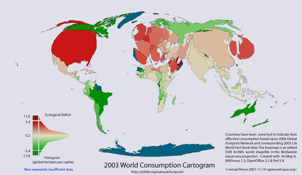
This thematic map shows two variables; 1) coloration indicates reserve(green) – deficit(red) of national biocapacity and 2) area indicates absolute consumption of biocapacity.
Consumption = Appropriated National Biocapacity + Imports - Exports
The area of each country has been distorted to represent its consumption i.e.; its ecological footprint. Countries which appear larger than normal are consuming more than their fair share and smaller countries are consuming less.
Notes:
1) Features with missing data are shown in blue, and are scaled as if they were in ecological balance.
2) Fair share of a country is considered to be equal to the global biocapacity per capita, currently 2.1 global ha/person. Note that this does not take into account land dedicated for reserves for biodiversity.
There is also a dynamic web GIS on the site that, although buggy, allows you to play around with a few types of cartograms.
Tim Holland, a graduate student in Geography at McGill, working with Andy Gonzalez and Greg Mikkelson, and I has recently mapped out US household inequality (using the Gini coefficent to measure inequality) at a county level for 1970, 1980, and 1990. The inequality data is from François Nielsen at University of North Carolina – Chapel Hill.
The striking increase in USA inequality between 1970 and 1990 primarily occured in the 1980s. The spatial pattern of inequality is interesting, but perhaps unsurprising. Why inequality decreased in some counties in the central USA is perhaps more interesting.
For comparison, below is a map of international inequality from Wikipedia (note the color scheme is slightly different).
Lost cities are in fact a relative historical rarity. True, Atlantis remains unfound, let alone rebuilt. Pompeii and Herculaneum were buried permanently beneath the hot ejecta of Vesuvius in 79AD. Timgad was sacked by both the Vandals and the Berbers and lost to history until archeologists uncovered it in the 1880s. Monte Albán, on the heights above the modern Mexican city of Oaxaca, flourished for 2,000 years before the Spanish crushed it for all time. But these are the exceptions. Much more common in the annals of urban history are cities that have rebounded again and again from even horrific devastation. The Romans leveled Carthage after the Third Punic War, salting it for good measure. But it was the Romans themselves who later resurrected the port city and turned it into an administrative hub for their African possessions; even today Carthage persists as a suburb of Tunis. By about 1800, urban resilience becomes the rule. No major city in the last 200-odd years has been completely destroyed, in spite of humankind’s ever-increasing power to do so. There are only a handful of exceptions; St. Pierre, Martinique — the “Paris of the Antilles” — was annihilated by a volcanic eruption in 1902 and never rebuilt. Only one man survived, and only because he was locked in solitary confinement. But for every St. Pierre, there are a hundred cities that bounced right back from catastrophic destruction.
The subject of urban resilience is one I explored with Lawrence J. Vale in an anthology entitled The Resilient City: How Modern Cities Recover From Disaster (Oxford, 2005). Our comparative study revealed no short answers as to why urban sites in the modern age are rarely abandoned (factors such as embedded infrastructure, private property rights and insurance, even the political symbolism of reconstruction for a nation have all played a role). Our study did yield, however, a number of key points and common themes about both disasters and urban resilience, many of which have gained new relevance in the wake of Hurricane Katrina. For one, cities vary enormously in their resilience. Just as some people can fend off a traumatic illness while others succumb, not all cities are equally capable of rebounding from a shock to the system.
As anecdotal evidence of past climate change goes, some of the most pleasant to contemplate involve paintings of supposedly typical events that involve the weather. Given the flourishing of secular themes in European art from the Renaissance on, most of this art comes from the 16th to 19th centuries. As readers here will know, this coincides (in the public mind at least) with the so-called ‘Little Ice Age’ and somewhat inevitably this canon of work has been combed over with a fine tooth comb for evidence of particularly cold conditions.
The image that brought this issue to mind was seeing ‘Washington crossing the Delaware’ at the Met the other day and seeing the iceberg-like ice it was imagined (75 years after the event) that the rebels had had to row through in 1776. The first thing I noticed was that the ice is completely wrong for a river (which is just one of the errors associated with this picture apparently). River ice is almost always of the ‘pancake’ variety (as this photo from the Hudson river shows), and doesn’t form ‘growlers’. However, the confusion of artistic license with climatology appears to be a bit of a theme in other oft-cited works as well….
Kevin Kelly, co-founder of Wired Magazine, author of Out of Control, and former editor of the Whole Earth Review, an early systems and sustainability magazine writes about collaborative web filtering sites. The sites he mentions are interesting for technology news and entertainment, but are not good at international news, environmental and development news, science news, or many of the other types of news that I find interesting. However, the collaborative filtering approaches behind these approaches are quite interesting. Science sites that attempt to do the same thing include Faculty of 1000, which isn’t free but uses reviews by many academics to identify interesting papers in different fields (previously mentioned on this weblog). Nature had a news article Science in the age of the web (Nov 2005) on the slowness of scientists in adopting such tools. Kevin Kelly reviews a bunch of sites and their approaches:
What’s new? Consensus Web Filters
Like a lot of people, I find that the web is becoming my main source of news. Some of the sites I read are published by individuals, but I find the most informative sites are those published by groups of writers/editors/correspondents, including those put out by Main Street Media (MSM). However for the past three months my main source of “what’s new” has been a new breed of website that collaboratively votes on the best links.
This genre does not have an official name yet, but each of these sites supplies readers with pointers to news items that are ranked by other readers. None of these sites generates news; they only point to it by filtering the links to newsy items. Using different formulas they rank an ever moving list of links on the web. The velocity of their lists varies by site, but some will have a 100% turnover in a few days. I check them daily.
Rather than resolving political debate, science often becomes ammunition in partisan squabbling, mobilized selectively by contending sides to bolster their positions. Because science is highly valued as a source of reliable information, disputants look to science to help legitimate their interests. In such cases, the scientific experts on each side of the controversy effectively cancel each other out, and the more powerful political or economic interests prevail, just as they would have without the science. This scenario has played out in almost every environmental controversy of the past 25 years (Sarewitz 2000).
This phenomenon has led to a widespread pathology: the use of bad arguments for good causes.
The map shows the 114 major watersheds in the world. The map includes the largest transboundary watersheds and small basins that are representative of a particular geographic area. Omitted regions, shown in white, are primarily smaller coastal drainage basins or regions with no permanent rivers (more info).


 The image that brought this issue to mind was seeing ‘Washington crossing the Delaware’ at the Met the other day and seeing the iceberg-like ice it was imagined (75 years after the event) that the rebels had had to row through in 1776. The first thing I noticed was that the ice is completely wrong for a river (which is just one of the errors associated with this picture

