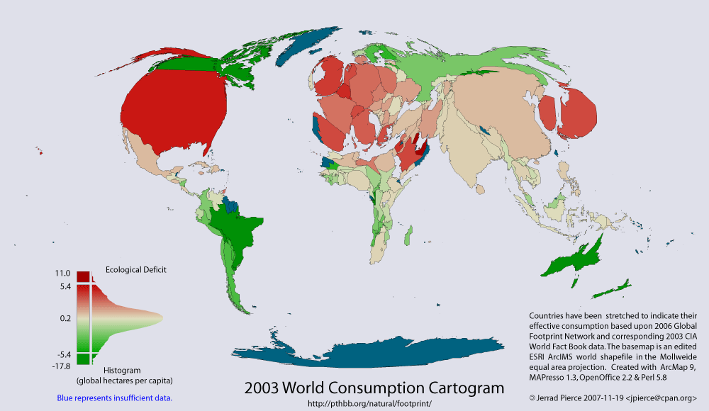
Following up on other global mapping posts (population cartogram (distorted) & pop vs. economy cartograms), here is a cartogram from Jerrad Pierce showing countries sized by their ecological footprint and coloured according the their status as a net surplus or debtor nation.
One the website, the map is explained:
This thematic map shows two variables; 1) coloration indicates reserve(green) – deficit(red) of national biocapacity and 2) area indicates absolute consumption of biocapacity.
Consumption = Appropriated National Biocapacity + Imports - Exports
The area of each country has been distorted to represent its consumption i.e.; its ecological footprint. Countries which appear larger than normal are consuming more than their fair share and smaller countries are consuming less.
Notes:
1) Features with missing data are shown in blue, and are scaled as if they were in ecological balance.
2) Fair share of a country is considered to be equal to the global biocapacity per capita, currently 2.1 global ha/person. Note that this does not take into account land dedicated for reserves for biodiversity.
There is also a dynamic web GIS on the site that, although buggy, allows you to play around with a few types of cartograms.

One thought on “Visualizing Ecological Footprint of Nations”